
This hypothetical project intended to exercise and test my design skills from a user experience perspective.
I evaluated TJMaxx's online shopping experience and explored a few improvements using UX design principles.
The first step, talking to the customers of course!
talking to customers
In addition to talking to customers, I visited multiple TJMaxx stores to gather a better understanding of the store and its customers. This was one of my favorite tasks of this project.

Initial Screening
Received 38 responses for an initial survey that was sent out.

Qualified for usability test
11/38 customers qualified for the usability test.

Target Customers
4 of them were available for testing and represented TJ Maxx’s target audience.
(3 Female, 1 Male)
Reveal The Designer
TJ Maxx does not advertise/publicize the designer brand names on its website because it prefers to save money on licensing fees. This means users cannot search by brand and must “Reveal The Designer” across many products online.
Seasonal Fashion
TJ Maxx’s differentiator is offering “current season designer brands” but these are not prominently displayed on their site (i.e. The Runway)
The Treasure Hunt
Search Engine Optimization
Like their in-store experience, TJ Maxx’s online content is vast and overwhelming. Their target audience enjoys “the treasure hunt” but also does not want to go digging.
TJ Maxx’s desktop website is separate from their mobile site (unresponsive). In order to
rank higher in SEO, they will need to reorganize their content so it is displayed consistently across devices.
Observations from the physical store and the digital website.
target persona
UX design processes followed
01.
Information Architecture & Sitemap
02.
Task Flow &
User Flow
03.
Layout Analysis, Feature analysis & Element analysis
04.
Heuristic Evaluation, Card sorting & Usability Testing
05.
Low to Mid fidelity mockups & Usability testing


site map
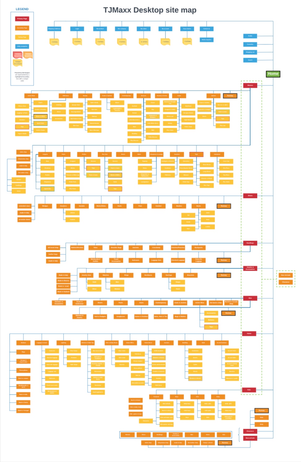
Decoding the site map and understanding the information architecture was an ardent task, huge in scale. This understanding gave me confidence in generating solutions for the design opportunities as they evolved.

TASK
You have been invited to your friend's wedding one month from now.
The attire is semi-formal.
SCENARIO
Navigate the TJ Maxx website and add a designer dress and shoes of your choice to your shopping bag.

Layout Analysis
All competitors/comparators take advantage of using the full desktop viewport.
Century 21 & GILT’s landing pages stand out by utilizing editorial imagery that accurately portrays their “high-fashion” positioning.
Nordstrom Rack and GILT utilize a simplified primary navigation bar offering focused categories.
Nordstrom Rack, Century 21, and GILT have clear utility navigation icons in the upper right-hand corner
Nordstrom Rack and GILT offer “Help” and “Leave a Message” for customer service inquiries.
feature Analysis
All competitors/comparators have 4-6 different sort/filter options, allowing customization of the product selection.
Nordstrom Rack, Century 21, and GILT provide secondary and tertiary categories in the left side menu to refine the search even more.
Century 21 and Burlington have a header within the Product Gallery that showcases the product
categories at the top of the page.


element Analysis
GILT, Nordstrom Rack, and Century 21 provide the user with a visual hierarchy using different colors and font weights which are consistent with their branding.
Century 21 provides a checkout progression timeline at the top of the page so users can track where
they are in the checkout process.
Heuristic evaluation
usability testing
Scenario
You have been invited to your friend's wedding one month from now. The attire is semi-formal.
Task
Navigate the TJmaxx website and add a designer dress and shoe of your choice to your shopping bag.
4/38 tests
4/4 users completed the task.
The usability test was conducted remotely using Lookback.io with 4 users representing the target audience and selected from 38 prospective users.
"What is the runway?"
"Nothing(Filters) seems to be working, so I am going to look for something red."
I decided to focus on Findability as an opportunity to improve.
"These categories do not make sense and are irrelevant."
How
might
we...
The Problem Statement
How might we enable a new customer to perform online shopping at TJmaxx with high accuracy by providing easy navigation and sensible filters so that she might reach the checkout window quickly?
Why
Information overload in each category leads to decision fatigue with excessive categories and sub-categories, irrelevant filters/sorts and also overlooking of information (i.e. The Runway).


